Last updated on April 20, 2012
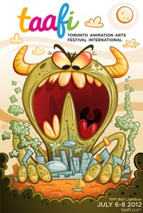 About a week or so ago, we posted Mike Geiger‘s design for the inaugural TAAFI poster. Lots of you seem to like its obvious cartoonery, so we decided to ask Mike and Rich Duhaney (of TAAFI) for a little background on the design.
Mike’s pretty busy, but he managed to squeeze this out for us:
TAAFI had a very specific idea of what they wanted in terms of the theme and message they wanted it to portray.
We actually went through quite a few ideas before ending up at this one, but hopefully I found something that resonates with the festival’s directive in the final version.
I’m just happy to have the opportunity to do something like this and be a part of the TAAFI festival in this respect. Beyond the poster itself, I’m really looking forward to a fantastic weekend of all things animation.
Rich had this to say:
Why we chose Mike Geiger: His style has an edge and energy that immediately tells viewers that this is about having fun and we wanted our audience to know that fun is what they are in for in July at TAAFI. With Mike it is clear his influences are cartoon ones: Ren and Stimpy, UPA, and that Saturday morning stuff. This cartoon representation aligned with the TAAFI teams sensibilities and the general desire and feedback we’ve gotten from industry and fans around town.
– Needs to be Fun, Quirky and Energetic (things Mike was chosen for already embodying)
– Needed to honour the TAAFI branding established by fellow partner, Iris Wu (http://cargocollective.com/iriswu)
The fantastic result is what you see! Both TAAFI partners Iris and Mike were enthusiastic about the possibility of the festival and brought their fullest to this project for which TAAFI is grateful and we all benefit.


Awesome poster. It’s definitely fun to look at. Just a quick note, at the bottom of the article the date says June instead of July. Just thought that might confuse some people.
Thanks David, keen eye.
Hey no problem. In another life I must have been a copy editor =)