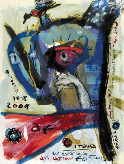
 Ok.
Ok.
I’m going to diginify this with a post.
A while back, Amid Amidi posted an image of this year’s OIAF poster.
People commmented.
Sheridan Instructor Peter Emslie posted a reaction to it on his blog.
Lots of people commented.
Chris Robinson, Artistic Director of the Festival, posted about it on his blog.
People commented.
Amid noticed and posted a follow up.
More comments.
Michael Sporn tumbled to the “discussion” and posted about it on his blog.
Lots of people commented. Including Peter Emslie and Theodore Ushev, the creator of the poster in question.
Theodore posted on his blog too, by this time tired of the whole affair.
I’m really not sure what else to say here.
I like the poster. It’s a good piece of art. I’m not sure how effective it is as a poster, bit I like it as art. Peter Emslie, and a large contingent of like-minded people do not. I have no issue with that. I’m dissappointed that an educator can’t take a more open approach to art, and I’m disappointed at how he chose to make his argument, but those are his choices. I’m also disappointed that anyone still trots out the “my kid could do that” argument when addressing art of any kind. Culturally, we’ve outgrown that. Find a more constructive way to explain your opinion, or don’t offer any explanation at all. Opinions don’t require explanation. Taste is subjective.
The question seems to be, is this a good poster for an international animation festival?
I encourage you all to read the posts, read the comments.
I’ll write my thoughts later.
m


It looks like a blue Plankton vomiting red jello. I’ve seen a few festival films which almost induced a similar response. Well, we can’t say we weren’t warned.
I think its stunning…and actually makes me interested in the festival now…because I wasn’t before.
What a waste of time and energy. I’d prefer the people expend more energy and thought discussing the films shown at the OIAF and other animation festivals.
As I said elsewhere, not to trivialize the poster in anyway, but it’s like arguing over the cover of a book that no one has read.
When I saw it I remember thinking how it was a very creative image for an animation festival –much more a fine-art piece in orientation but these things are usually ‘eye or mind of the beholder’ in my books. I’m just happy the festival is on and that people are going. I really don’t lose sleep about the image as I figure anyone who is attending will come regardless of an image.